Selected work02Food delivery · Lead Product Designer
Cargolandfood.Everything you need, in one app.
A Nigerian-built marketplace where consumers, businesses and riders order, sell and deliver. Designed end to end for all three, after research with all three.
- Role
- Lead Product Designer · UX research lead
- Timeline
- March–June 2025
- Scope
- 3 user types · 100+ mobile screens · design system
- Market
- Lagos and Abuja, 5 cities planned
- 01The problem
- Food, groceries, pharmacy runs and drinks happen in the same week, yet Nigerians juggle five apps that each port a global playbook.
- 02The bet
- Not another food app: a neighbourhood marketplace, food-first, built for three sides at once.
- 03My role
- Lead product designer and UX research lead, from interviews and strategy through flows, visual design, testing and implementation.
- 04The outcome
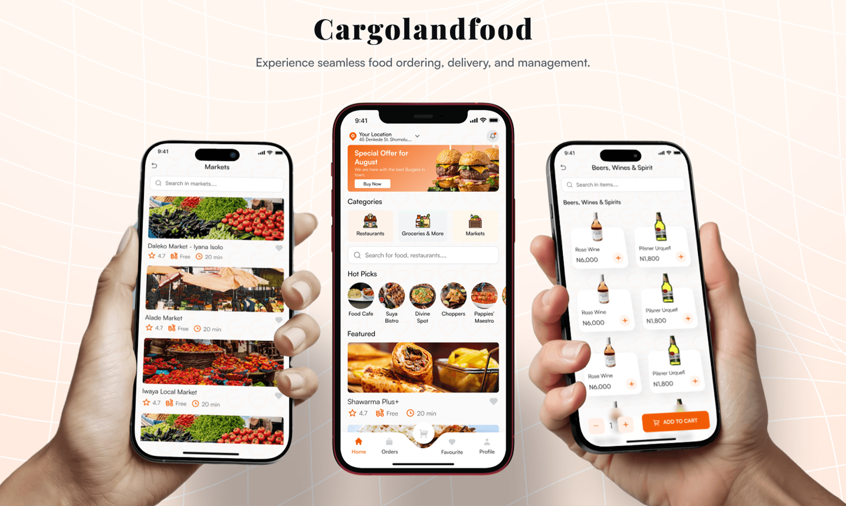
- A three-sided ecosystem in light and dark. The consumer app is live on Google Play.
01Context
Why use five apps when one will do?
Most of them ported global playbooks into Nigeria with little local adaptation, and none solved for the daily reality that food, groceries, pharmacy runs and drinks all happen in the same week.
So the brief wasn't to design another food app. It was a complete neighbourhood marketplace: food-first, but reaching into everything Nigerians actually order each week.
Built for foodies who need everything, not shoppers who want food.
02Problem
One marketplace, three broken experiences.
Designing for one side meant designing for all three in parallel. Customers want speed and reliability, restaurant partners need order management and growth, and riders need transparent earnings and efficient routes. Each group has its own pain points, mental model and definition of success.
- 01Hidden fees at checkout.Users kept describing price jumps between cart and final total. Fees appeared as vaguely named line items, so comparing apps before paying was nearly impossible.
- 02Inconsistent food quality.Nothing reliably separated great vendors from mediocre ones once an order left the kitchen. Reviews skewed toward extreme experiences, not the typical one.
- 03Long delivery at peak hours.Lagos peak hours stretched 30-minute estimates into 90-minute waits. Users wanted realistic ETAs, not optimistic ones, and live updates when things changed.
- 04Slow, scattered restaurant onboarding.Partners described 2–3 weeks before going live, with documents, menu setup and verification spread across email, calls and broken portals.
- 05Unclear rider earnings.Riders couldn't predict a day's income. Trip rates, distance bonuses and tips arrived bundled in a weekly settlement, with no breakdown by trip.
03Research
Designing for the three sides of one marketplace.
Online and in-person interviews with all three groups, plus business research and a competitive audit.
18–45 · Urban and suburban Nigeria
Customers
“Convenience and quality, without surprises.”
Middle to upper-middle class, heavy smartphone users. Time-conscious, social, price-sensitive, but willing to pay for quality. Strongly influenced by reviews.
Small eateries → established chains
Restaurant partners
“Growth, without the logistics.”
Growth-oriented owners with varying digital readiness. They need order management, delivery handled for them, marketing support and real analytics.
18–35 · Students and gig workers
Delivery riders
“Earnings they can predict.”
Flexible income, transparent pay, reliable tools and efficient routes. Most of their work happens at peak hours.
Competitive audit
Every competitor left a gap the marketplace could fill.
The audit covered customer experience, partner tooling, rider experience and business model. Three patterns kept appearing: food-only focus, high commission rates, and poor local-market intelligence.
Market leader
Jumia Food
“Slow, and split across apps.”
45–60 minute deliveries, 20–25% commission, separate food and grocery apps. E-commerce first, food second.
Strongest local
Chowdeck
“Food only.”
Limited tech features, basic restaurant tools, and no expansion into daily essentials.
International
Glovo
“Not built for Nigeria.”
25–30% commission, limited local-market understanding, and missing local markets and vendors.
Global benchmark
UberEats
“No pharmacy, no markets.”
Food-only focus, high pricing, and limited investment in African markets.
04Thinking
A double diamond, in three movements.
The double diamond (empathise, define, ideate, prototype, test, implement) gave the team and stakeholders a shared language for every checkpoint. The project moved through it in three movements.
- 01Concept: research and strategyInterviews with customers, restaurant partners and riders, business research, the competitive audit, and aligning stakeholders on product goals.
- 02MVP: flows and visual designUser flows for all three sides, then the visual language and a shared component library, with distinct interaction patterns per audience.
- 03Final product: polish and testingInteraction polish, usability testing and design iterations, then monitoring implementation so the decisions shipped as designed.
05Design
Fast enough to keep hungry users.
Onboarding
The bare minimum, and nothing more.
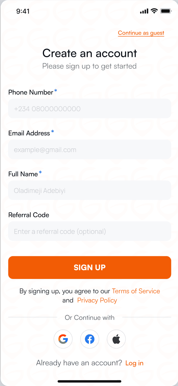
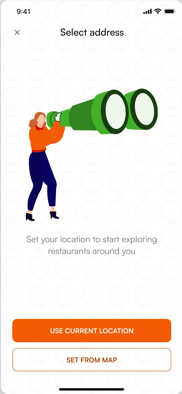
Onboarding is the first contact with the product, so it carries the value proposition and gets out of the way. Three illustrated screens set expectations, then sign-up asks only for what a first order needs, with the address chosen in one tap from your current location. Guests can skip straight in.
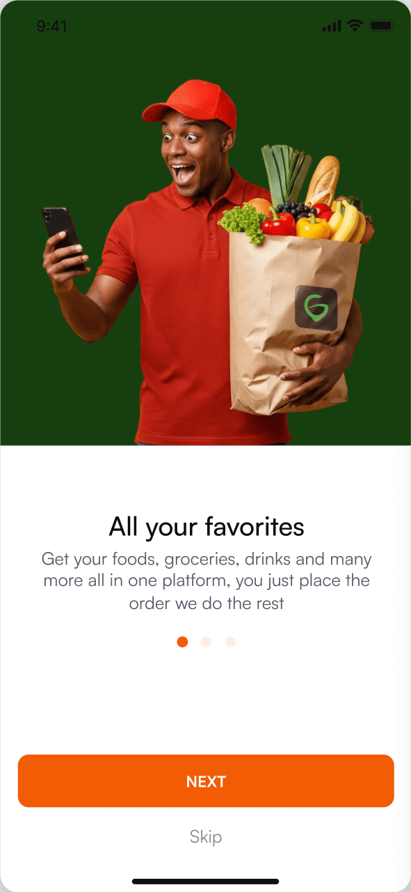
01All your favourites
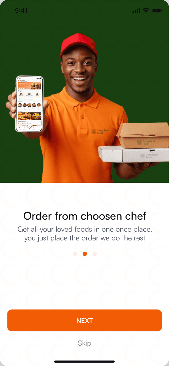
02Your chosen chef
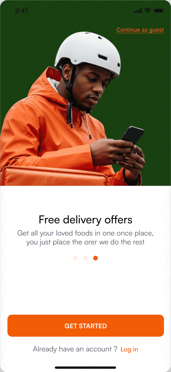
03Free delivery
04Sign up
05Set your address
Make an order
From browse to checkout in five clear steps.
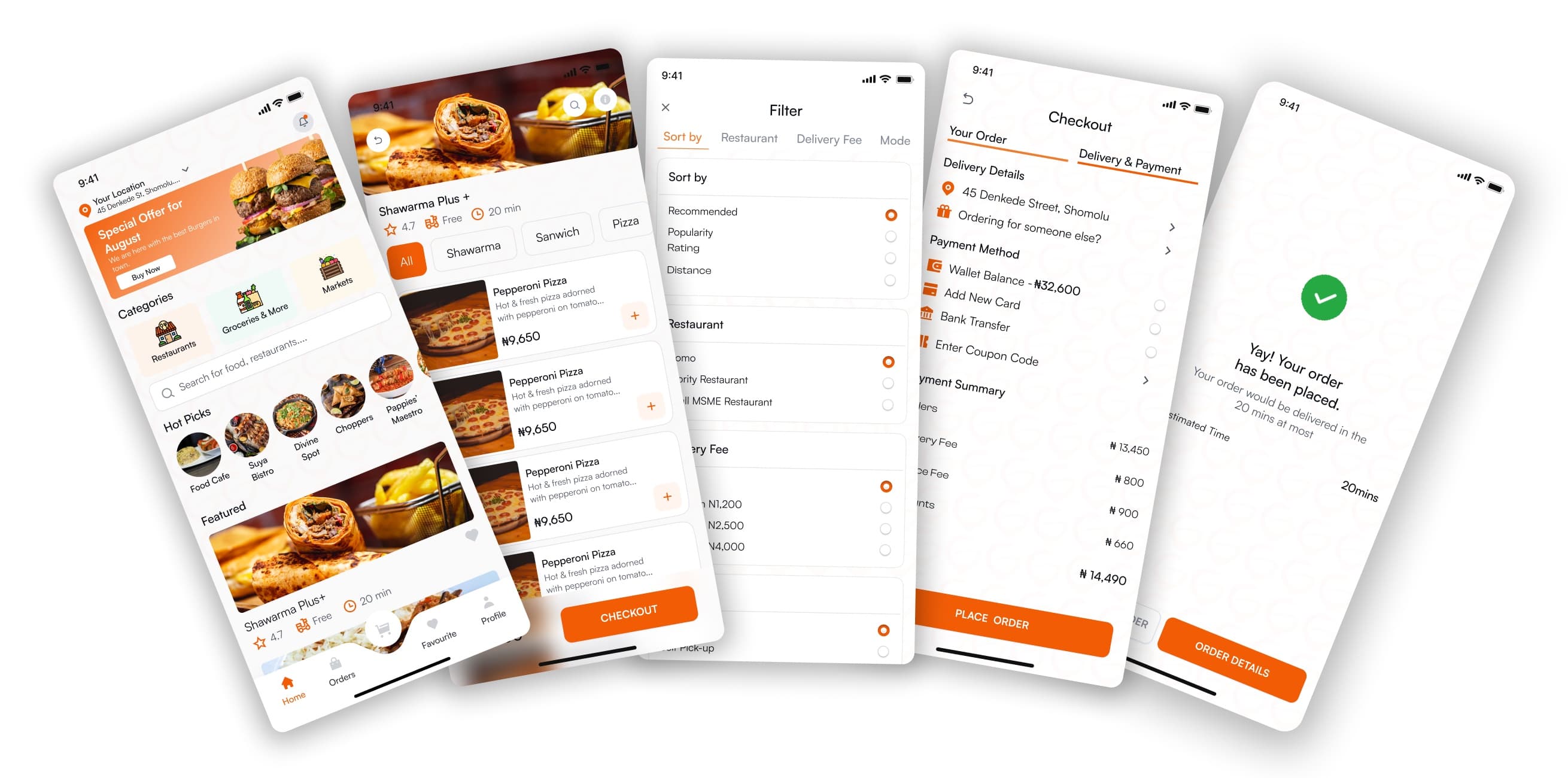
Home, restaurant, filter, checkout, confirmation: one linear flow, every step designed for thumb reach on a six-inch screen. Payment collapses into a single sheet, and the address is reused from onboarding, so nobody types it twice.
Track an order
Live tracking that earns trust.
Tracking answers the four questions people actually have, in the order they have them.
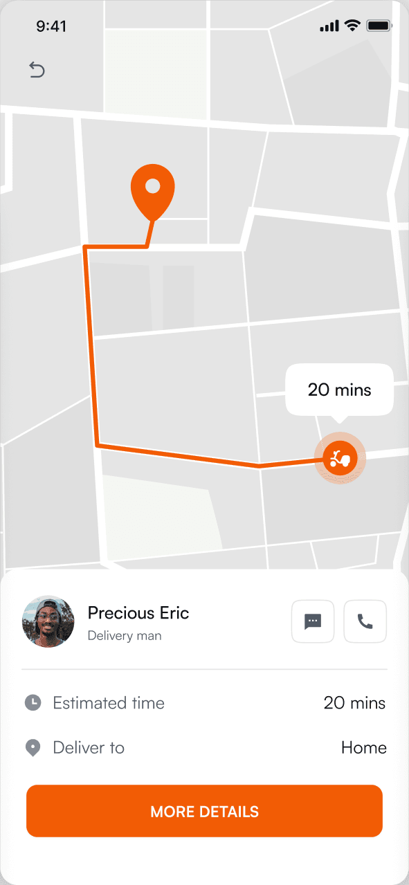
- 1Where is my food?A live map follows the rider along the real delivery route, not a straight line.
- 2When will it arrive?A realistic estimate that updates when things change, the answer to Lagos peak-hour waits.
- 3Who is bringing it?The rider's name and photo, so the handoff at the door is easy.
- 4How do I reach them?Message or call in one tap, without leaving the screen.
Status updates fire on real events (preparing, on the way, delivered), and the Orders tab keeps a full history with one-tap reorder.
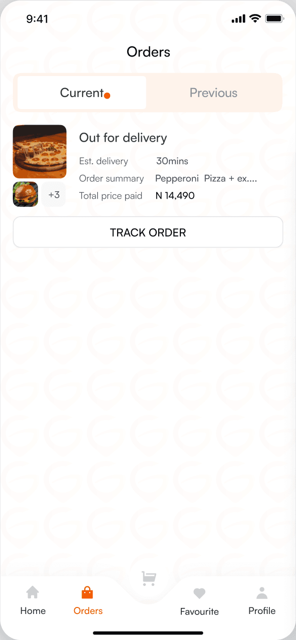
01Current order
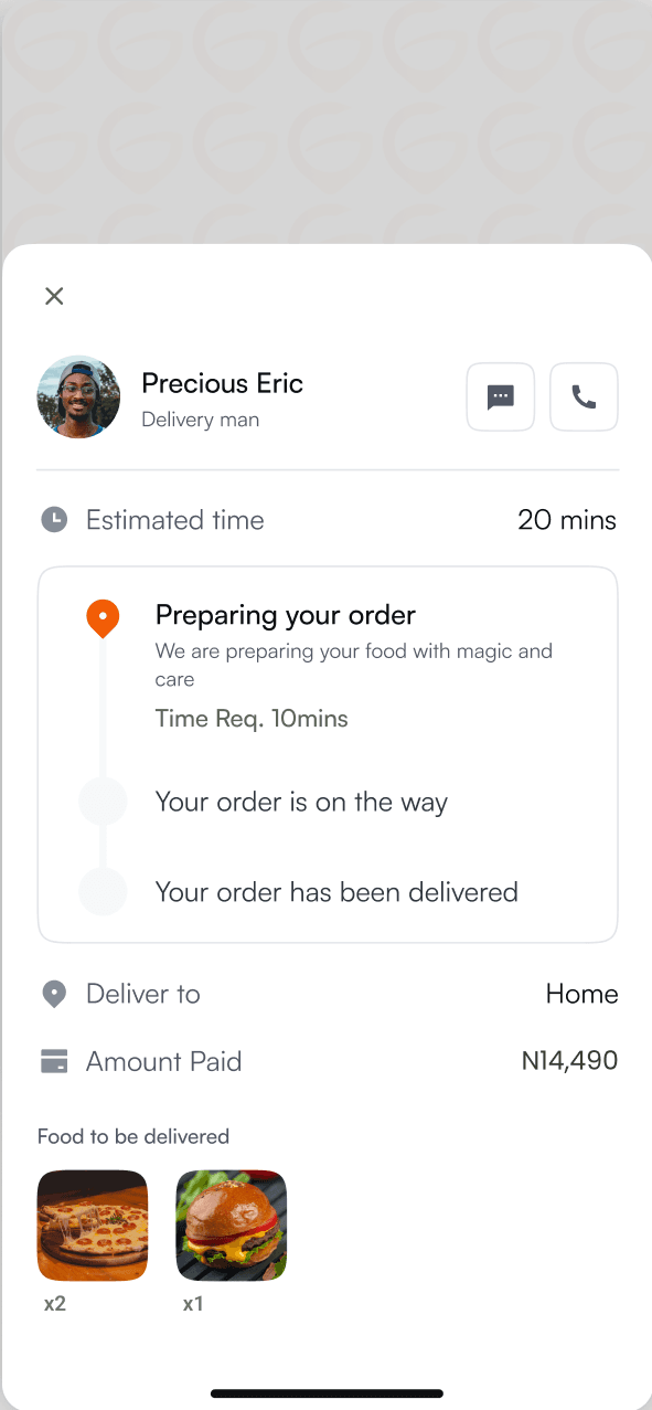
02Order status
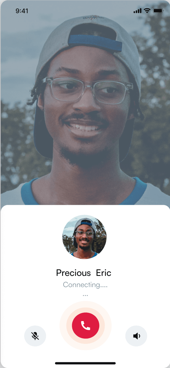
03Call the rider
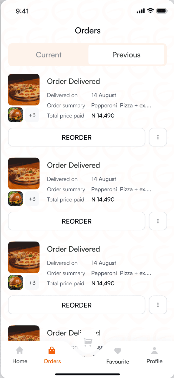
04Reorder
The system
100+ screens. Two themes. One system.
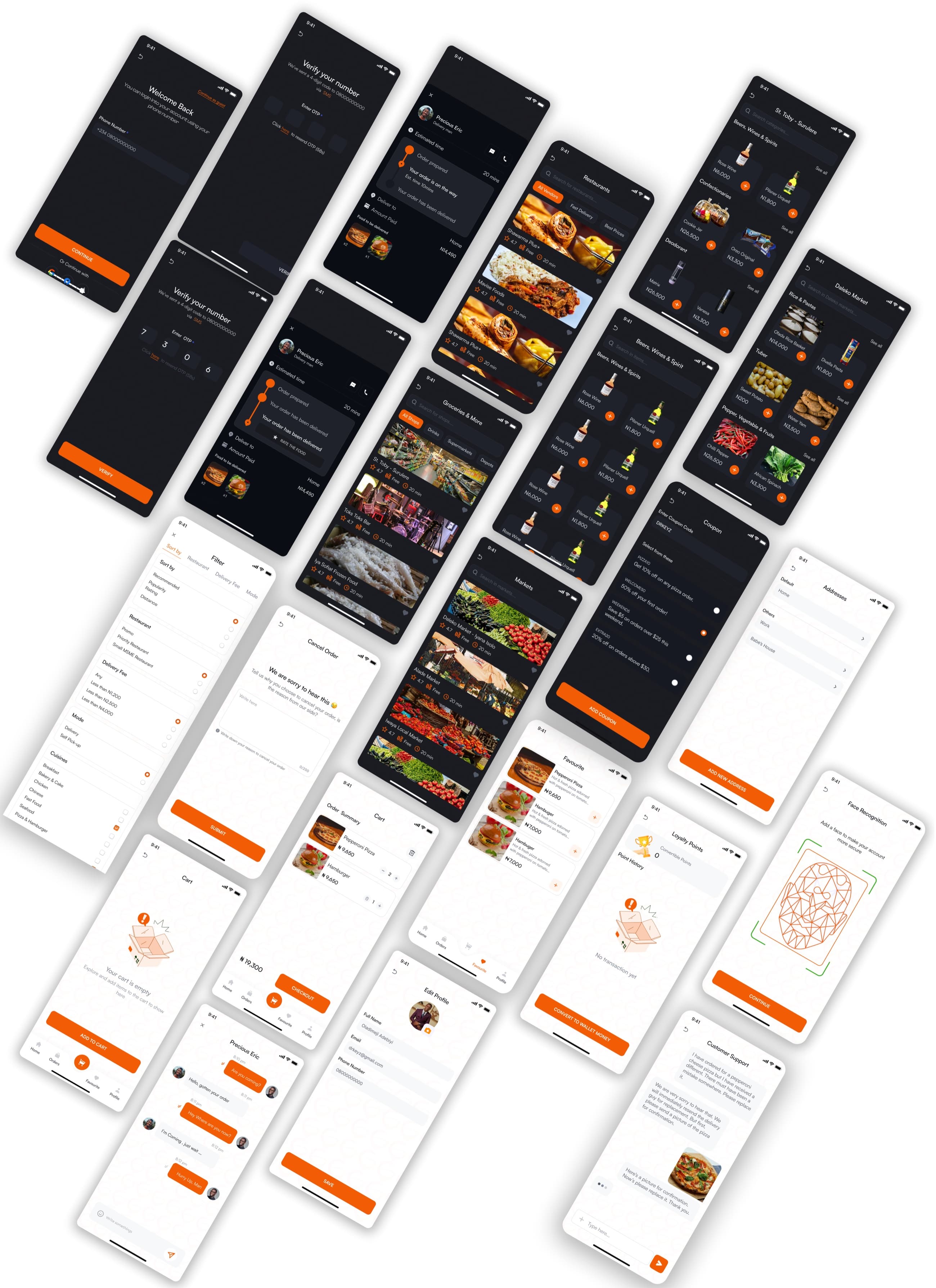
Cart, favourites, coupons, biometric sign-in, empty states, restaurant pages, the drinks and market verticals: each ships in light and dark from the same component library. Dark mode isn't an inversion. It was tuned for low light, with deeper contrast on actions and softer surfaces everywhere else.
06Iteration
Tested, then tuned to how people use it.
- 01Three filters, up frontTesting showed people really used three filters: sort, restaurant and delivery fee. Those now lead the filter sheet, and everything else waits below.
- 02Dark mode, tuned for real conditionsRiders confirm orders at night and customers check ETAs in dim restaurants, so the dark theme got deeper contrast on actions rather than a simple colour flip.
07Outcome
What shipped.
3×
Three-sided ecosystem
Customer, restaurant partner and rider apps, designed end to end with shared design tokens and distinct patterns per audience.
100+
Screens, light and dark
Onboarding, ordering, tracking, profile, wallet, vendor verticals, and empty and error states for every primary surface.
20–30
Minute delivery target
Designed against a 20–30 minute target, about half of incumbents' 45–60, so speed signals beat decoration on every screen.