Selected work03HR tech · Product Designer @ Chams Access
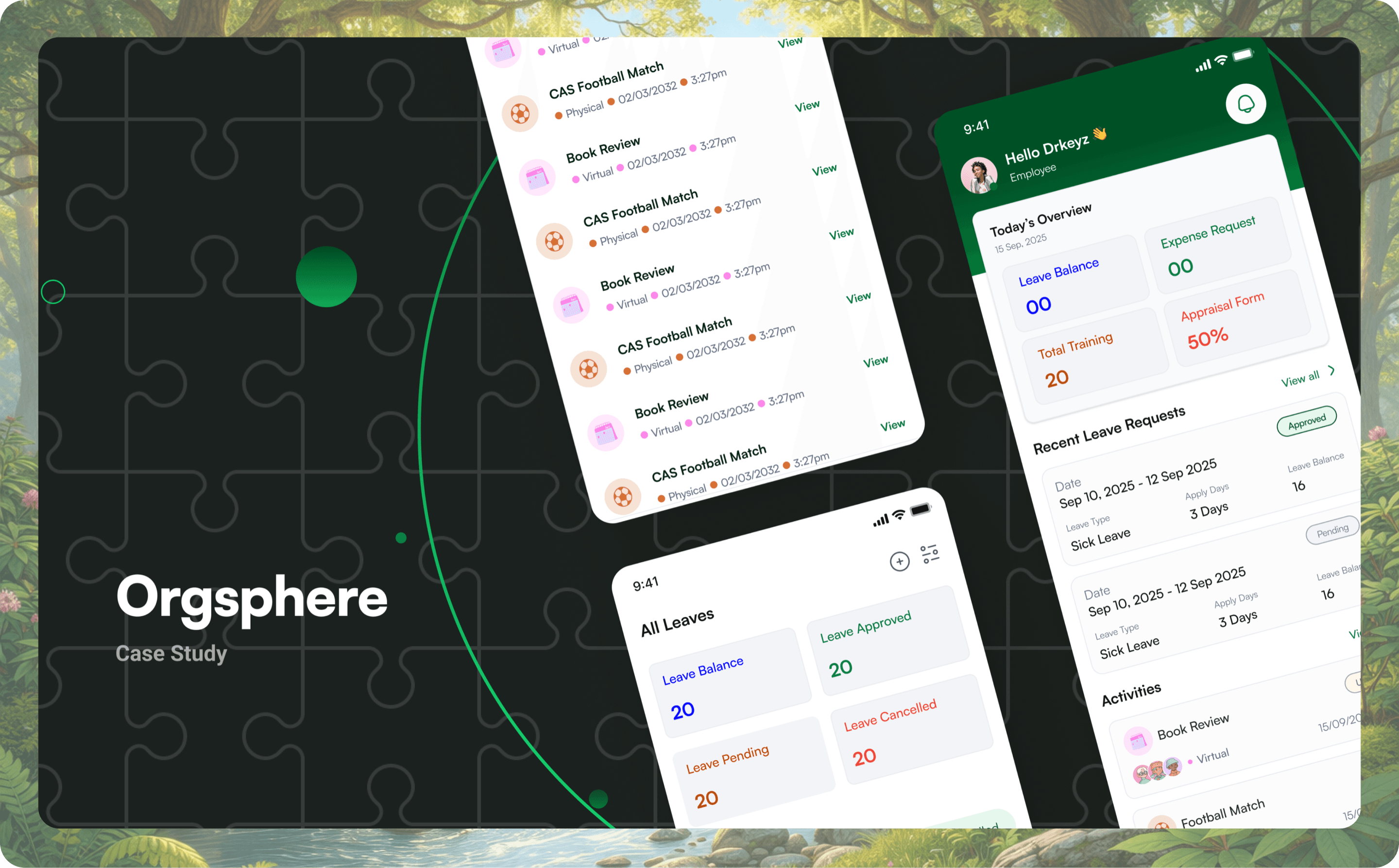
Orgsphere.Designed with intention, built for people.
A mobile HR platform that gives employees self-service for leave, expenses, performance reviews and company activities, from one app instead of a stack of paper.
- Role
- Product Designer @ Chams Access
- Year
- 2025
- Scope
- 5 core modules · 40+ screens · design system
- Audience
- 3 user roles, one application
- 01The problem
- Leave lived in emails, expenses travelled on paper, and reviews surfaced once a year, opaque and disconnected from the work.
- 02The bet
- One pattern, learned once: if leave works a certain way, expenses and KPIs should work the same way.
- 03My role
- Product designer: research, information architecture, wireframes, visual design, prototyping and developer handoff.
- 04The outcome
- Five modules unified in one app, three roles served, 40+ production screens from a single component library.
01Context
From paper-heavy HR to a single app.
Leave requests lived in emails. Expense claims travelled on paper. Performance reviews surfaced once a year, opaque and disconnected from day-to-day work. Company events had no central home, and turnout suffered for it.
The opportunity was a single mobile app for all of it. Not enterprise software wearing a friendly face, but a workspace built around the employee first, with managers and HR served by the same shared logic.
02Problem
Four broken patterns. Four direct fixes.
- 01Requests ran on email and paper.Fix: one app where employees apply for leave, submit expenses, track balances and see the approval chain instantly.
- 02No visibility into status.Employees had to chase HR and managers in person. Fix: real-time status tracking, with a notification at every approval milestone.
- 03Performance reviews were opaque.No way to track KPIs or see feedback as it happened. Fix: a transparent KPI module with quarterly goals, self-ratings, manager scores and comment threads.
- 04Activities had no home.Events and training were scattered, so attendance was low. Fix: an activities hub with details, venues and notes in one place.
03Research
One app, three distinct lenses.
Stakeholder interviews with HR leads at Chams Access, employee surveys, and an audit of HR apps such as BambooHR and Keka. Three groups use the app, each with different goals, so the design shares one set of patterns but tunes density, primary actions and approval flows per role.
Primary user · ~70% of traffic
Employees
“Know where every request stands, without asking.”
Apply for leave, submit expenses, track KPIs and stay informed about company events. Self-service and transparency first.
Approvers · tier 1
Line managers
“See what's waiting, approve in one tap.”
Review leave and expense requests, score direct reports on KPIs and give feedback, from an at-a-glance pending queue.
Approvers · tier 2
HR administrators
“The whole organisation, not just one team.”
Final-tier approvals, oversight of review cycles, and employee records across every department.
04Thinking
Learn one module, know them all.
Five stages, each validating the last before the next began: research, information architecture for the leave, expense, KPI and activity flows, low-fidelity wireframes tested internally, high-fidelity design, then interactive prototypes and an annotated developer handoff.
The principle that shaped every screen came out of the architecture stage.
Once you learn how leave works, you already know how expenses work. The same pattern carries you through every module.
05Design
Every module, the same shape.
Onboarding
Three steps. No friction.
A three-step walkthrough introduces the product before sign-in. Each slide pairs one value proposition with a real preview of the app, so people see what they're getting before they're asked to log in. Credentials are provisioned by the employer, so there's no sign-up form at all.
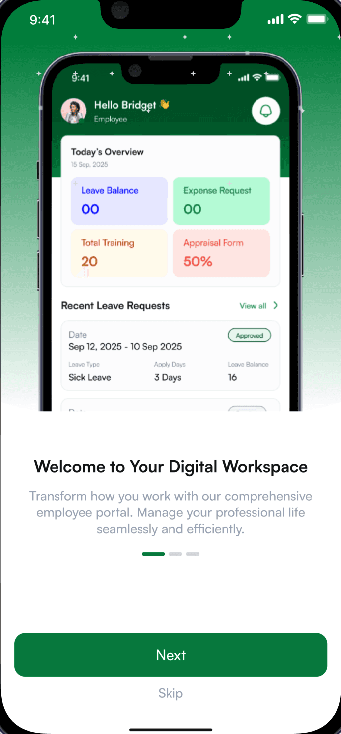
01Your workday
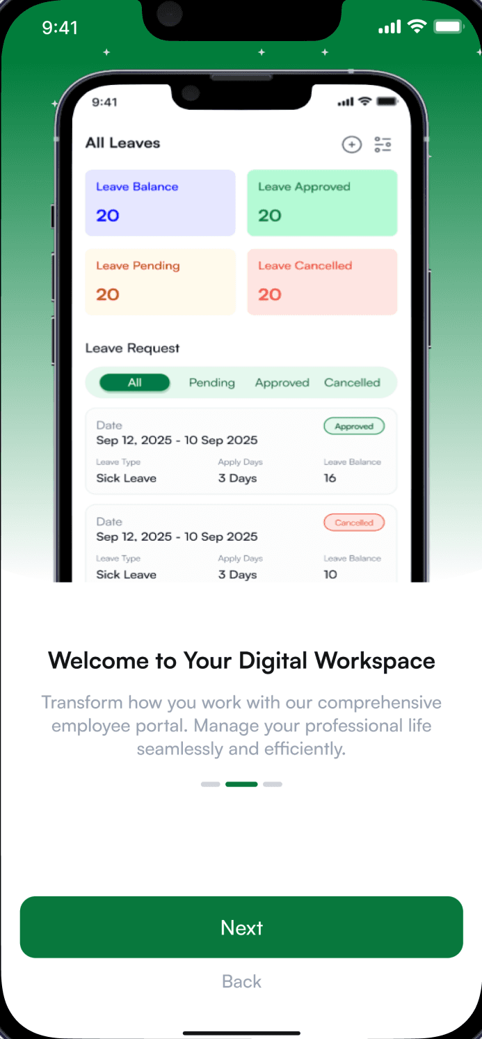
02Your leave
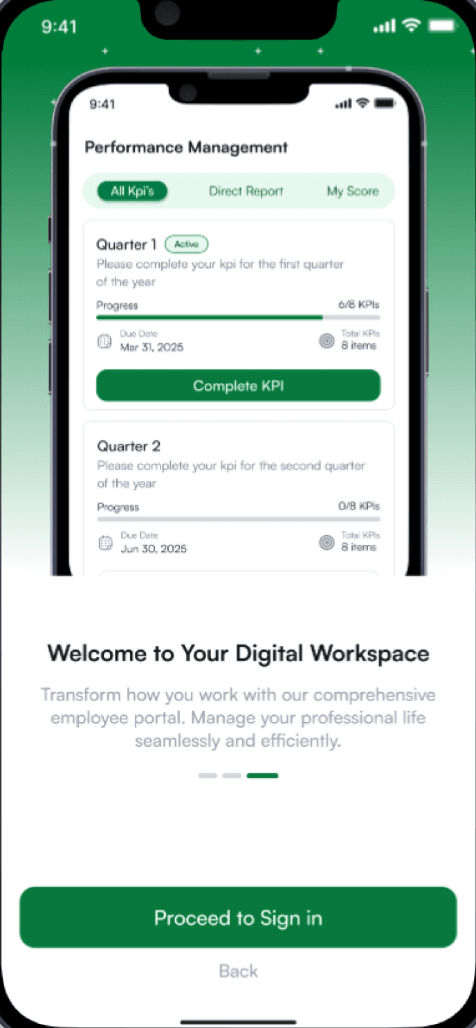
03Your performance
Home
An instant snapshot of the workday.
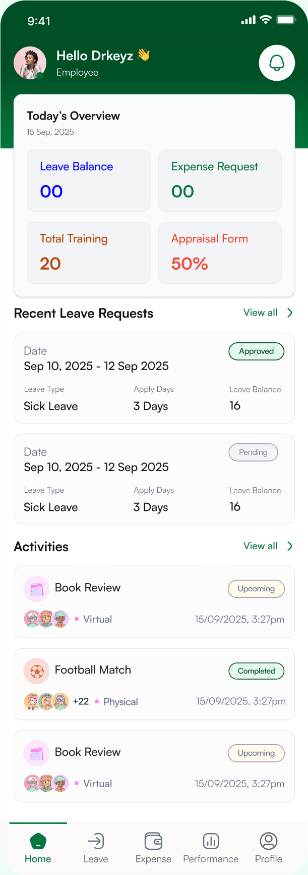
- 1A personal greetingA small human touch that makes an HR tool feel like a workspace, not a form.
- 2Four numbers that matterLeave balance, expense requests, training and appraisal progress, readable before scrolling.
- 3Status at a glanceRecent requests show their status inline, so nobody has to open them to know where they stand.
- 4What's coming upUpcoming and completed company events, with who's attending, right on the home screen.
Leave
Multi-level approvals, all in real time.
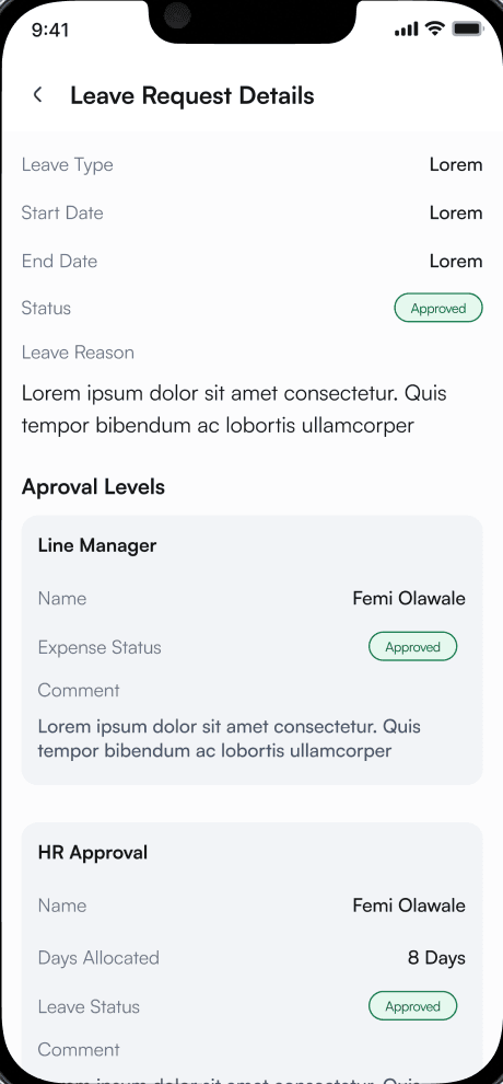
- 1Status, never colour aloneApproved, pending and cancelled each read as a labelled badge, in semantic colour.
- 2The whole chain, visibleLine manager first, then HR, each with its own status and comment. The email back-and-forth becomes one screen.
- 3Allocation, confirmedHR's approval shows the days actually allocated, so there's no surprise later.
Expense
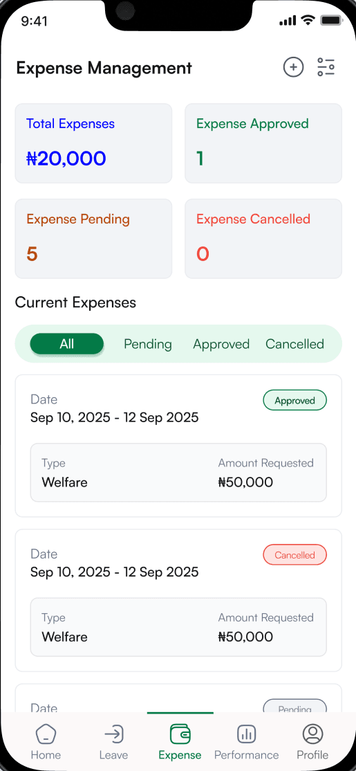
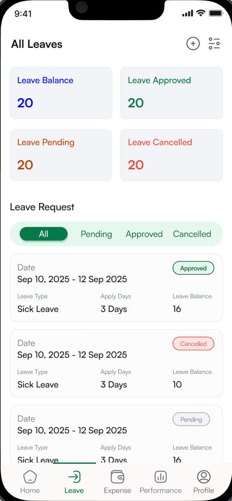
The same pattern, in a different module.
Expenses follow leave exactly: summary cards on top, filter tabs below, then requests with their details. Drag to compare. Anyone who has applied for leave already knows how to claim an expense.
Performance
Quarterly KPIs, made transparent.
Employees self-assess, see their manager's scores and track progress across the year. The flow moves through four states: every quarter at a glance, the review split into objectives and skills (weighted 80/20), a one-to-five rating, and the completed review with comments from both sides.
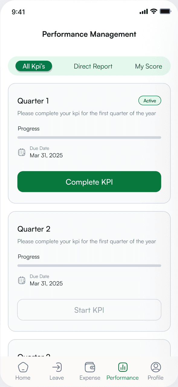
01All KPIs
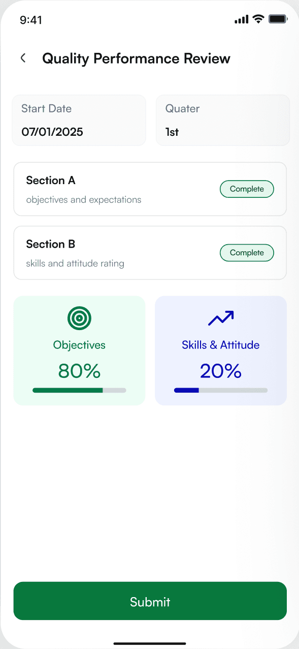
02KPI details
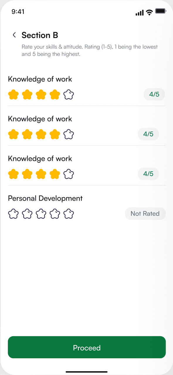
03Skills rating
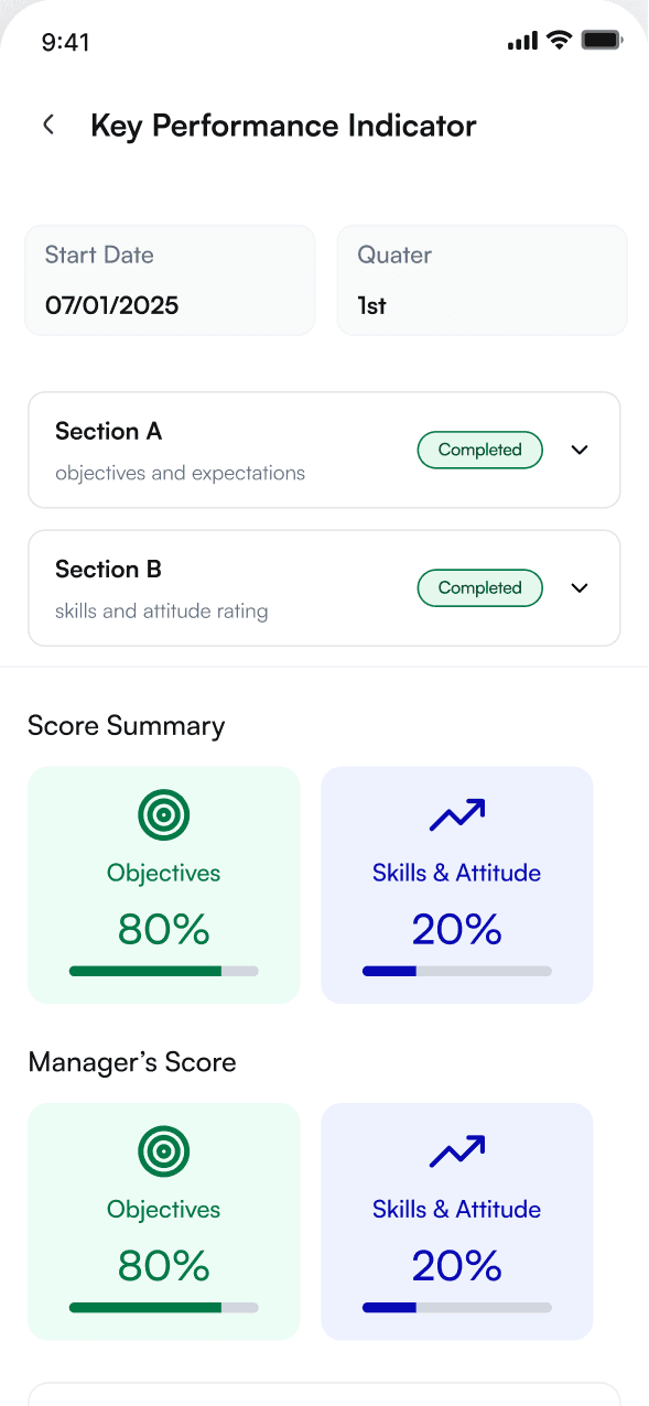
04Completed review
Activities
Never miss what matters.
Events and training are categorised with icons for quick scanning. Each event has its venue, time and important notes on one screen, and notifications use type-specific icons with mark-all-read and an unread count.
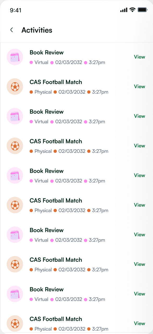
01Activities
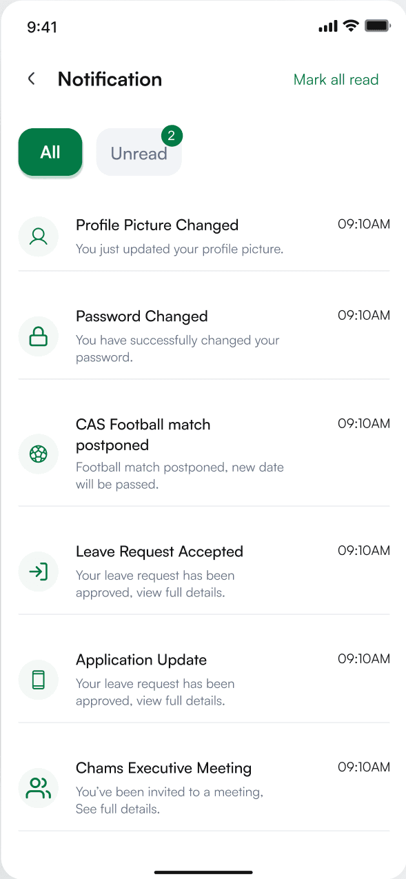
02Notifications
Design system
A system that reads at a glance.
Typography
Satoshi
Clean · legible · mobile first · 8pt grid
Card-based UI with subtle shadows, pill badges and rounded actions on an 8 / 16 / 24pt rhythm. Summary first, detail on tap; the green action always sits in the same place.
Palette
- Primary#08783D · Actions, approved
- Accent#E5F8EE · Surfaces, highlights
- Warning#B54708 · Attention, pending
- Destructive#F04438 · Cancelled, delete
Status, never colour alone
- Approved
- Pending
- Cancelled
Actions
06Outcome
What shipped.
5×
Modules unified
Onboarding, Leave, Expense, Performance and Activities, in one app, from one component library.
3/3
User roles served
Employees, line managers and HR administrators: shared base patterns, role-tuned approvals and density.
40+
Production screens
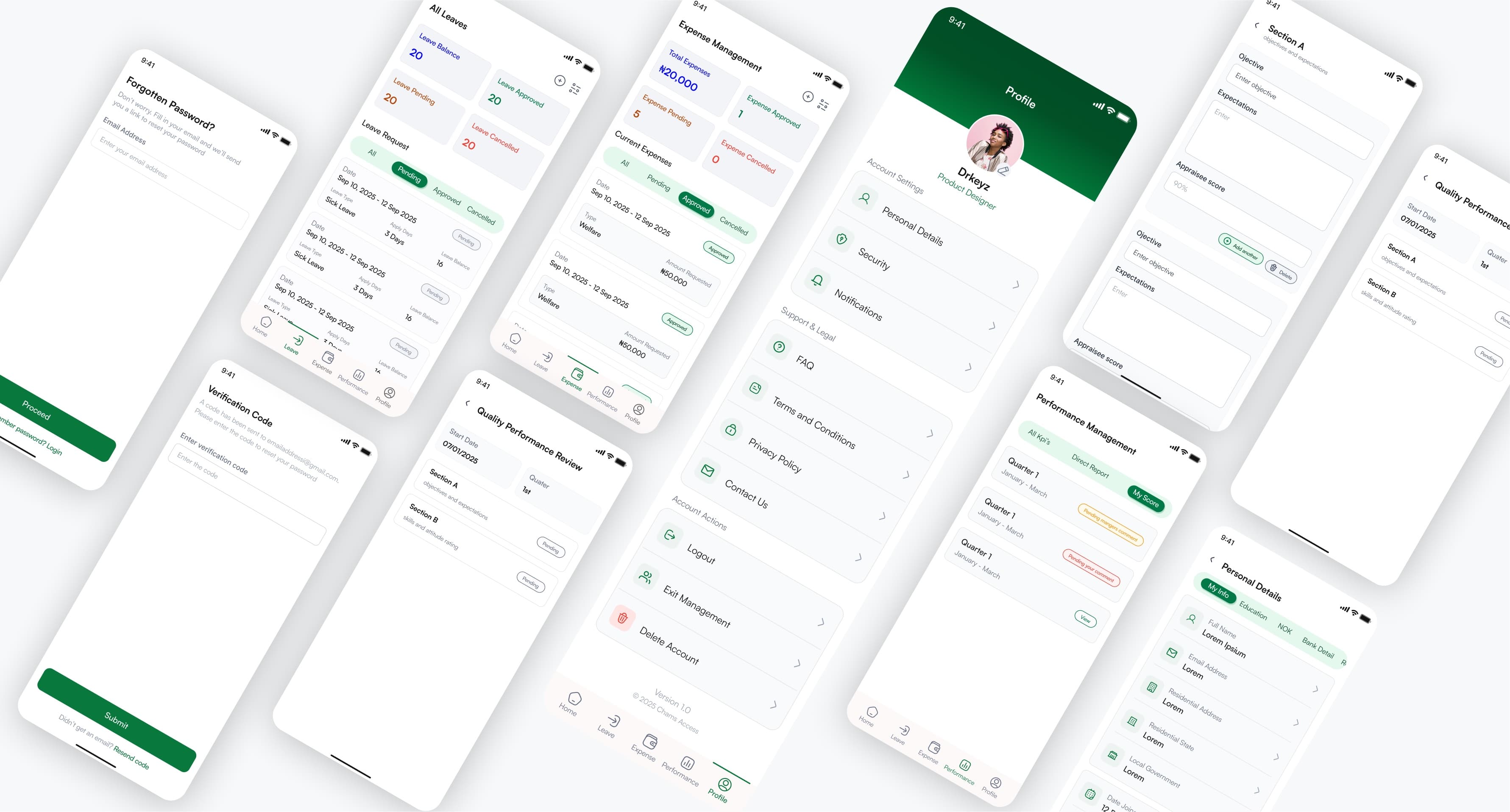
Primary flows, edge states such as password recovery and empty states, and the full profile and settings surface.